Any serious Sketch project will have you thinking about typography rather soon. For a fantastic introduction into web typography I wholeheartedly recommend Metej Latin’s email course Better Web Type. I also recommend the official blog post on the matter: Typesetting in Sketch. For serious design projects you will also have felt the need for an Atomic Design approach as well. If not, start with Creating a product design system in Sketch by Alexandre Trimoulet (never mind that what they’re doing is not a real Design System.)
But, armed with all that knowledge, how do you efficiently implement good typography in a complex Sketch project?
Maybe you have read Text System Mastery with Shared Styles by Bunin — good. But I propose a different approach that’s worked for us. Our approach is based on symbols and not only ensures identical styles but also enforces correct margins and line heights for copy text and headings throughout the project.
Here are the ground rules:
- Don’t use shared text styles at all, ever.
- Instead, use one symbol for every text style. Let’s call these atomic text symbols.
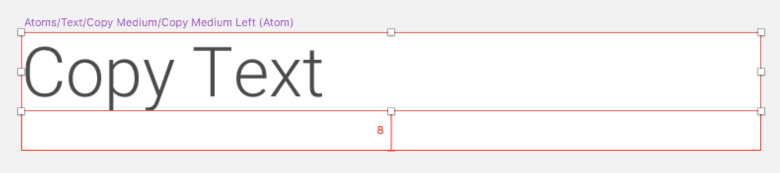
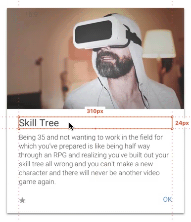
- Atomic text symbols have a one-line text layer and a bottom margin. They look like this (zoomed in):
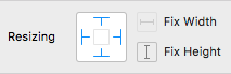
With these resizing settings:
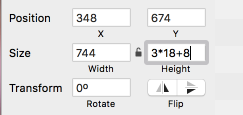
- The symbols’ height is determined by their line height plus margin (Their width is the same everywhere). That means that you can’t override them with other symbols of different sizes – which is a good thing since that would lead wrong line-heights or margins in the wrong places.
- When inserting an instance of an atomic text symbol with more than one line of text, determine its height by calculating the line-height × of lines + bottom margin, like so:
Pros
- No more ambiguity – every text layer has the correct height and margin.
- Layers snap into place easily.
- Frontend developers don’t have to guess margins. Zeplin works well with this approach:
Cons
- Sketch symbols for text are pretty bad when it comes to resizing and line breaks (not that text layers are much better). If your headline symbol has a line break in one instance but none in the other, you will have to calculate the correct symbol instance height yourself.
- Changing the font size of text symbols or a margin remains just as cumbersome as when using text styles. You will have to resize these symbols wherever you’ve used them.
Atomic Design
We’ve debated among our team if text + margin should be a molecule rather than an atom. We’ve decided that the discussion isn’t fruitful since it’s more important to us that we can use the atomic text symbols without the hassle of going through creating a molecule symbol for each type of atomic text symbol.
However, if you want to combine something like a heading + subheading into one symbol, you should create a molecule for that.
Here's an example Sketch file: Web Typography and Atomic Design in Sketch.
Let us know how this approach works for you!