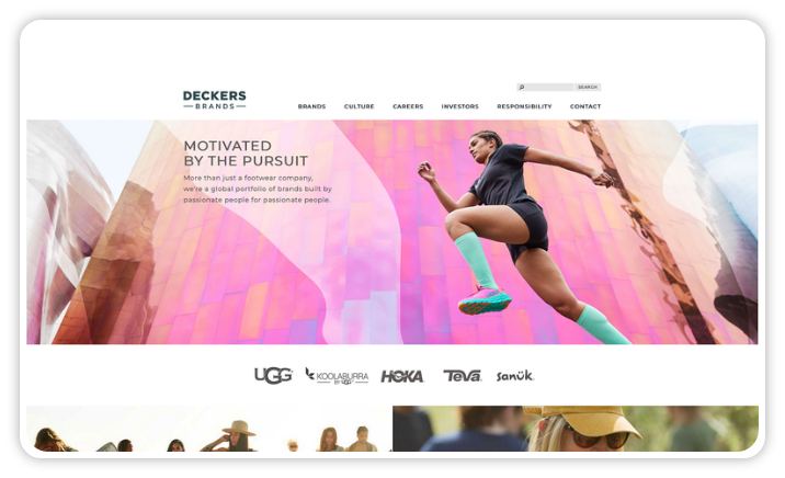
The trend to have a separate mobile site to the desktop site for retailers and brands seems to be continuing.
Most retailers came from a place where they had a desktop site (which often got delivered to tablet users as well) plus a mobile site that was built and managed in a completely separate system. And everyone knows this led to inconsistent experiences for customers and high levels of development and management cost for the retailer.
Then along came responsive web design and this was going to fix everything. One platform delivering essentially the same experience across all touchpoints with channel specific adjustments as required.
We are definitely seeing a trend with our customers to move away from this one-size-fits-all responsive approach. Increasingly, the strategy is for a responsive desktop and tablet experience alongside a (technically) different responsive mobile experience. This dual responsive strategy still means a common content pool but gives retailers the ability structure the content between desktop/tablet and mobile separately and also have separate business logic between the two.
While the reasons vary from customer to customer, there are a few common factors that have led to the change in strategy.
- The inexorable rise of sales from mobile devices inevitably focuses minds on how to make the experience as good as it can possibly be. The one-size fits all responsive approach leads to many compromises to cater for all the form-factor break points.
- Different structures. Retailers want to use the same content across devices and channels but usually want to structure the content differently for different experiences. For desktop customers, you might want an experience that has a lot of curated blog articles on the homepage while for mobile customers you may want to focus on getting them to product categories faster.
- Projects are difficult. Managing different stakeholders, competing business priorities and lots of requirements, all with finite budgets and resources, is complicated. The dual responsive approach mitigates this complexity to some degree and helps retailers iterate faster and avoid larger unwieldy projects.
- Time-to-market.
Different journeys and experiences across different touchpoints


