Marketers, listen up. Our goal is to achieve the highest possible conversion rates on our website, right? So we know a good user experience is crucial. We also know that relevant content improves the user experience, and that by better appealing to our target audience we can increase conversions.
But are you grappling with these content questions? For example: How do I write the best title or description? How long should the text be? Which images will attract attention? What would be a good call-to-action? And where should I place it?
It’s not easy to answer these questions from my site visitors, since I get no direct feedback from them. And what I really need is to know is their behavior and preferences in detail. Which I’m not going to get from a crystal ball (tempting though that may be).
Fortunately there are solid techniques for gathering qualitative and quantitative insights of user behavior. Analyzing these insights helps me understand the preferences of my target audience better and make data-driven decisions around content.
One of these techniques, of course, is A/B testing. Comparing two versions of a page – variant A versus variant B – can help improve conversion rate and reduce bounce rate. And there are also tools that allow you to compare more than two versions of a page, called A/B/n testing. (Note that this is different from multivariate testing, which allows you to analyze all variation items separately. But this approach requires a high volume of traffic in order to yield statistically significant results.)
The good news for CoreMedia customers is that Studio now enables marketers to easily perform A/B/n split testing from right within the platform – no need to add commercial third-party services. The process is simple: Create at least two variants of the content (aka a baseline and a competing candidate) that differ from each other in ways like text length, structure or image. Then fire up the A/B/n test to determine which variant resonates best with visitors.
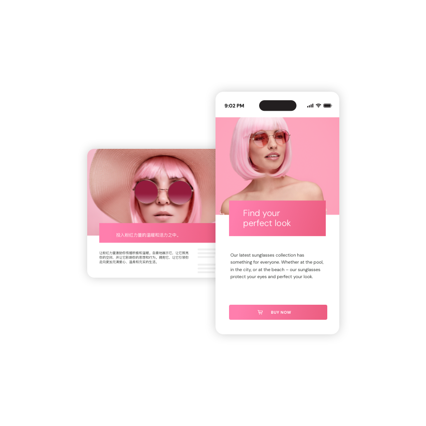
Let’s take a closer look at this with a simple teaser. A merchandiser for an online shop, for example, wants to figure out where place a product on a landing page so as many customers as possible click on it (and consequently buy it). But those questions again: How to illustrate the product best? And what should the wording of the CTA be?
The solution, of course, is to create two variants of the teaser to see which one resonates best with the target audience. But we can’t simply place one next the other on the same page. That would only lead to confusion.

